 OpenStation
Brand
Guidelines
OpenStation · Visual Identity Reference










AaBbCcDdEeFfGgHhIiJjKkLlMmNnOoPpQqRrSsTtUuVvWwXxYyZz
1234567890 +/@&!?()
SPACE_03 ACTIVE
Geist & Geist Mono
Geist carries everything human: headlines, UI copy, body text. Set it tight at display sizes and regular for reading.
Geist Mono carries everything the station says about itself: labels, metadata, statuses, coordinates. Small, uppercase, letterspaced.
Meet Mio. A small ghost blob that lives aboard the station: it glows in Pulse, drifts between windows, and shows up where the interface has something to say. It carries its own gradient, Miomesh, from Pulse into deep blue. Eight explorations so far.

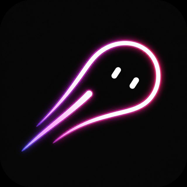


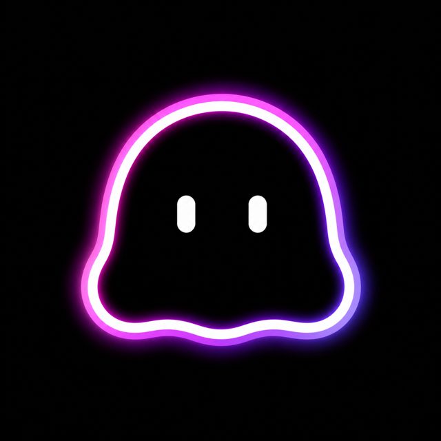
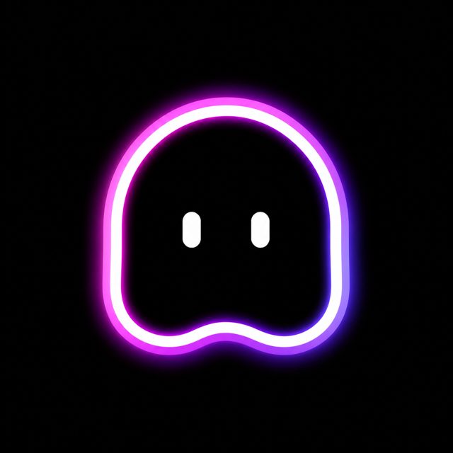

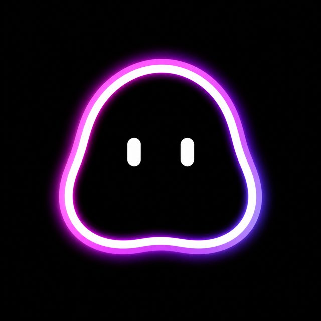

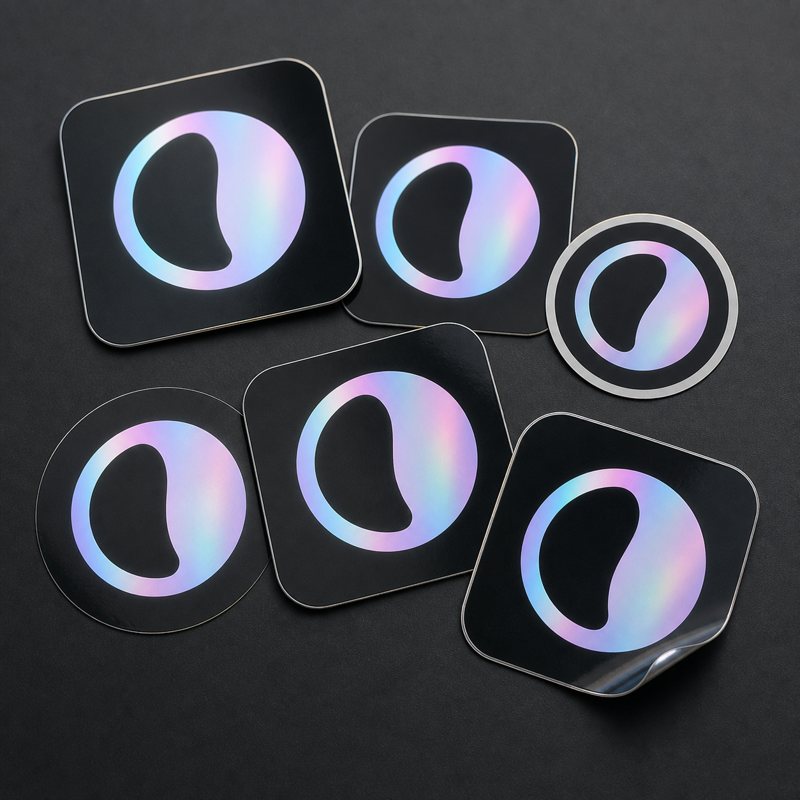
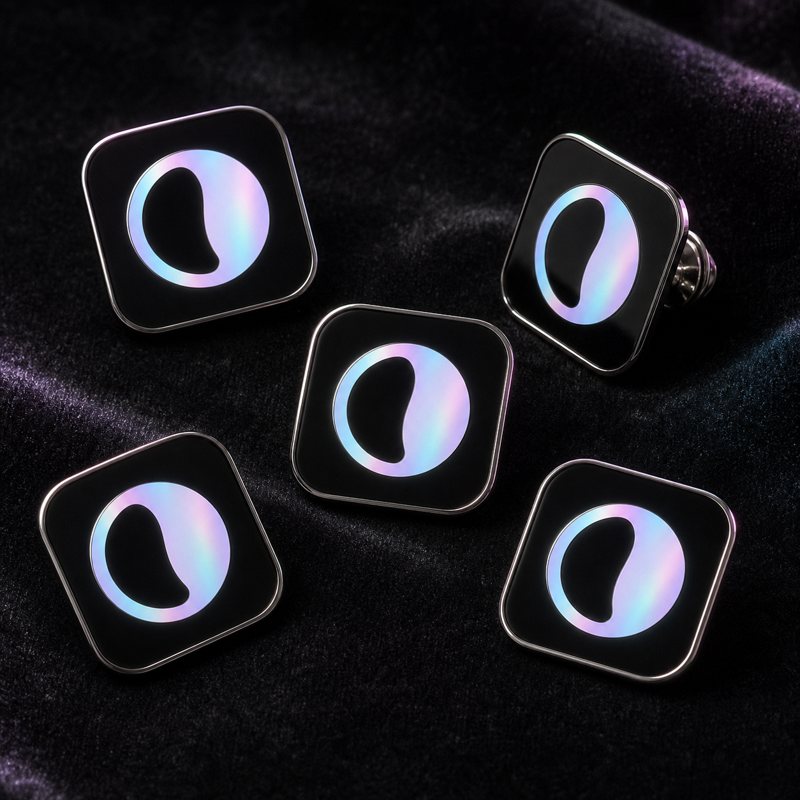
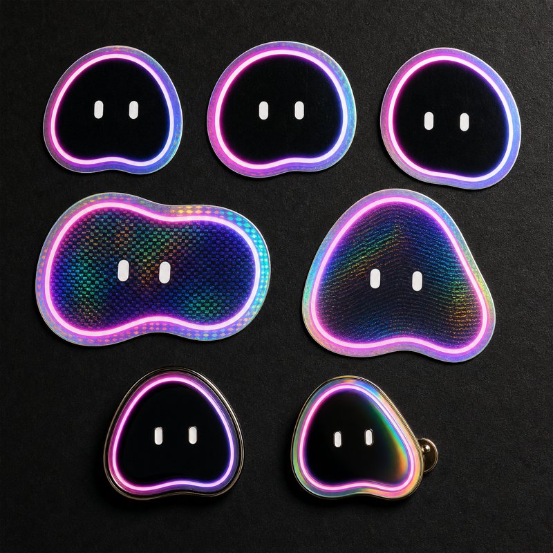
Deep space, engineered calm, gradients over photography. The product shows up on the Galaxy backdrop; the marks travel on their chips; the meshes do the color work.
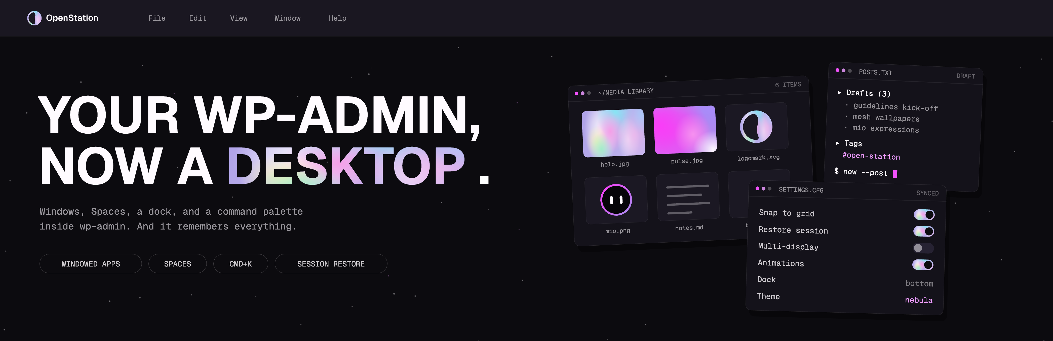
 OpenStationA4OpenStationA5OpenStation
Thirty icons, and only eleven of them are ours. Core owns the verbs and OpenStation owns the nouns: save, search, trash and settings come from @wordpress/icons and look the way they do in every other WordPress screen the user has ever seen. We draw one only when the thing exists because this is a desktop and wp-admin is not. A window you can drag is not a WordPress concept; a save button is.
So the set speaks two languages, deliberately. Core's are filled, with
square joins. Ours are monoline, on a 24 by 24 grid with a 17.5 live area, one 1.5 stroke,
round caps and joins, and a corner radius of 2, the same value Core uses. Redrawing a Core
icon in our hand would stop it being recognisable as the Core icon, which was the whole
reason for taking it. Nothing carries a color of its own: everything is
currentColor, so the same file works on Void and on Starlight and picks up
whatever text color surrounds it. The only filled shapes among ours are dots and the spark.
The spark is the brand sparkle and stays solid, because outlined it collapses at
16 px.
- Ours11, monoline
- Core's19, filled
- Grid24 × 24
- Live area17.5 × 17.5
- Stroke1.5, round caps and joins
- Corners2, matching Core
- ColorcurrentColor, never hardcoded
- Sizes16, 20, 24, 32, 48
One drawing, five sizes. Below 16 px the set stops working: scale the icon, never the stroke.
One SVG per icon in assets/icons/, plus a sprite that holds
the set. Reference an icon by name and it inherits the surrounding text color. Dropped in
with <img> it cannot inherit anything and renders black, so inline it or
use the sprite whenever color matters. Inside the plugin the same thirty arrive as
osIconSvg( 'window' ), and Core's nineteen are also reachable from PHP as
wp_get_icon() on WordPress 7.1.
<svg width="24" height="24" aria-hidden="true">
  <use href="assets/icons/openstation-icons.svg#os-window"/>
</svg>
Start from an existing icon rather than a blank grid. Keep the shape inside the live area, keep the stroke at 1.5, and let shapes touch the edge of the live area rather than floating in the middle. If a glyph needs a second element to be readable, it is usually two icons.

Core owns the verbs, OpenStation owns the nouns. Nineteen of the
thirty come from @wordpress/icons,
the GPL set behind WordPress 7.1’s wp_get_icon(). The other eleven are
drawn here, because they only exist once /wp-admin is a desktop: window, windows, dock, spaces,
copilot, snap, command, apps, widgets, user and lock. When a new icon is needed, take it from
Core if the concept is already there and draw one only if it is not. Core’s share grows as
the product does.
- From Core19
- Drawn here11
- Core library341 icons
- LicenseGPL-2.0-or-later
| Date | Change |
|---|---|
| Aug 20, 2026 | Iconography now shows the set as it actually is: eleven monoline icons that are
ours and nineteen filled ones from WordPress, each cell labelled with which. The
drawings were still the pre-adoption ones, all thirty in our own hand. Live area
corrected to 17.5, and the command palette is command now, so the
palette slot takes Core's own name, color. |
| Aug 13, 2026 | Mapped the icon set onto WordPress Core: nineteen of the thirty now come from
@wordpress/icons and eleven stay ours. Corner radius tightened from 2.5 to
2 to match Core. Added the full icon inventory as a nested page. |
| Aug 12, 2026 | Added the icon set: thirty monoline icons on a 24 grid, drawn in currentColor, shipped as one SVG per icon plus a sprite. Replaces the placeholder glyphs in Iconography. |
| Aug 5, 2026 | Brought the type scale in line with the Figma text styles: Geist Display is now Medium 500 and H1 SemiBold 600, Caption moves to 13px, both families carry Body Large / Body / Body Small, and line height is 1.3 with 1.5 on the body sizes. |
| Aug 4, 2026 | Rebalanced the logo lockup so the wordmark reads proportional to the mark, and darkened Pulse so it clears contrast minimums, with the meshes updated to match. |
Everything here is meant to be reused. OpenStation is an open-source WordPress plugin (GPL). Every asset that ships with the brand, including logo, wallpapers, illustrations and fonts, must be freely licensable and GPL-compatible.
Typefaces. Geist and Geist Mono by Vercel are licensed under the SIL Open Font License 1.1. The license text is bundled in this repository next to the font files.
Extenders. Third parties build on the public APIs and component kit. Treat the visual system as something others will reuse outside our control: tokens over one-offs, rules over exceptions.
No internal content. This guide is public. Only public links, public-safe imagery and freely licensed assets belong in it.
Machine-readable brand data lives next to this page. Point an AI agent or a build tool at either file and it has the whole system: colors, type, radii, assets, rules.
And a small human shortcut: every solid tile and gray swatch in the Color section copies its HEX on click.